


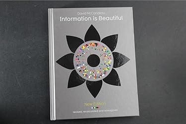


Apparently there were numerous errors in earlier versions of this book, but this review is for the 2012 edition which would appear to have corrected the omissions and errors of earlier editions.
The most serious fault that I can level at McCandless's "Information is Beautiful" is that is has almost single handedly given rise to the infographic obsession that means that you can hardly go online without encountering some designer's view of information that is all style and little substance. However, returning to McCandless's book shows how, when done with thought and insight, the graphic can add to the reader's understanding of the data. The book is one part modern art, one part geek-porn and several parts graphic design. It's not only interesting, but is indeed as beautiful as the title promises it to be.
When the book was first published, in 2009, many of the designs were seldom used - not most of them will be familiar and that threatens to minimise the importance of the book in the history of infographic design. Rather like HDR photography, a badly thought out infographic is dull and a bit cliche now, but when done properly, they really do get the message over. A picture is said to paint a thousand words, but a well-designed infographic can get over more than that. And this is full of them.
McCandless is good at sourcing the data. One slight concern though is that there is a fair bit that is sourced from Wikipedia - which is seldom the most reliable of sources on anything. With that caveat, this book is a modern design classic. It's beautiful, interesting, clever and thoughtful.
Download the free Kindle app and start reading Kindle books instantly on your smartphone, tablet or computer – no Kindle device required.
Read instantly on your browser with Kindle for Web.
Using your mobile phone camera - scan the code below and download the Kindle app.

What do customers buy after viewing this item?
Page 1 of 1 Start overPage 1 of 1
- Best Selling | Highest ratedin this set of products


About the author
Follow authors to get new release updates, plus improved recommendations.

Reviews with images
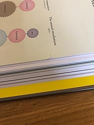
Great book but damaged pages
Great book and it’ll definitely be well received but annoying that some of the pages were dented and damaged...
Top reviews from United Kingdom
There was a problem filtering reviews right now. Please try again later.
Reviewed in the United Kingdom on 21 February 2014

Reviewed in the United Kingdom on 28 November 2010


Reviewed in the United Kingdom on 21 September 2010
Reviewed in the United Kingdom on 27 May 2014
Top reviews from other countries

Hendryk Weiland
Umfangreich, abwechslungsreich und manchmal überraschend
Reviewed in Germany on 29 September 2020