
Android のバージョンごとに通知が最適に表示されるようにするには: 標準の通知を使用する テンプレートを使用して、 通知を受け取れます。通知でより多くの内容を提供する場合は、 展開可能な通知の テンプレート。
ただし、システム テンプレートがニーズに合わない場合は、独自のテンプレートを使用できます 通知のレイアウトを作成します。
コンテンツ領域用のカスタム レイアウトを作成する
カスタム レイアウトが必要な場合は、
NotificationCompat.DecoratedCustomViewStyle
追加できます。この API を使用すると、コンテンツのカスタム レイアウトを提供できます。
通常はタイトルとテキスト コンテンツによって占有される領域ですが、引き続きシステムを使用
通知アイコン、タイムスタンプ、サブテキスト、操作ボタンの装飾。
この API は、展開可能な通知テンプレートと同様に、基本的な通知に基づいて動作します。 次のようなレイアウトです。
- 基本的な通知を作成する
NotificationCompat.Builder。 - 発信
setStyle()その関数にNotificationCompat.DecoratedCustomViewStyle。 - カスタム レイアウトを
RemoteViews。 - 発信
setCustomContentView()折りたたまれた通知のレイアウトを設定します。 - 必要に応じて、
setCustomBigContentView()展開された通知に異なるレイアウトを設定できます。
レイアウトを準備する
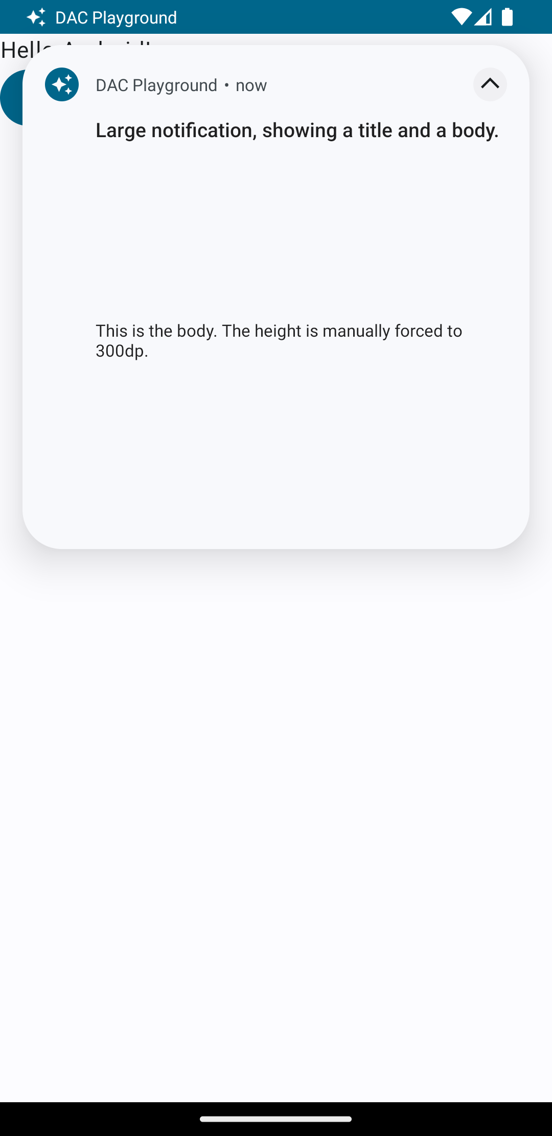
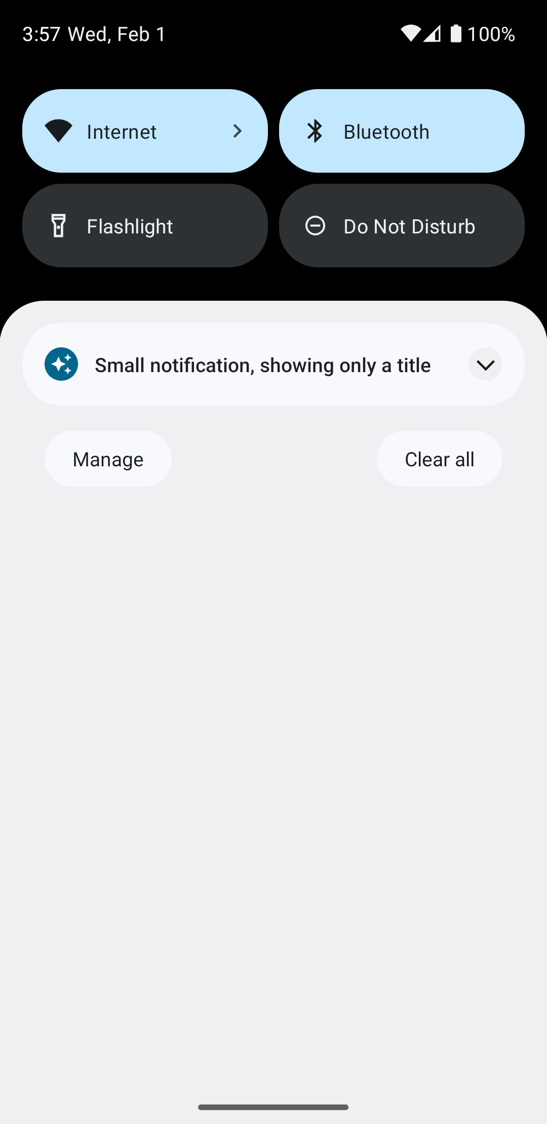
small レイアウトと large レイアウトが必要です。この例では、small レイアウトです。
次のようになります。
<?xml version="1.0" encoding="utf-8"?>
<LinearLayout xmlns:android="http://schemas.android.com/apk/res/android"
    android:layout_width="match_parent"
    android:layout_height="wrap_content"
    android:orientation="vertical">

    <TextView
        android:id="@+id/notification_title"
        style="@style/TextAppearance.Compat.Notification.Title"
        android:layout_width="wrap_content"
        android:layout_height="0dp"
        android:layout_weight="1"
        android:text="Small notification, showing only a title" />
</LinearLayout>
large レイアウトは次のようになります。
<?xml version="1.0" encoding="utf-8"?>
<LinearLayout xmlns:android="http://schemas.android.com/apk/res/android"
android:layout_width="match_parent"
android:layout_height="300dp"
android:orientation="vertical">
<TextView
android:id="@+id/notification_title"
style="@style/TextAppearance.Compat.Notification.Title"
android:layout_width="wrap_content"
android:layout_height="wrap_content"
android:layout_weight="1"
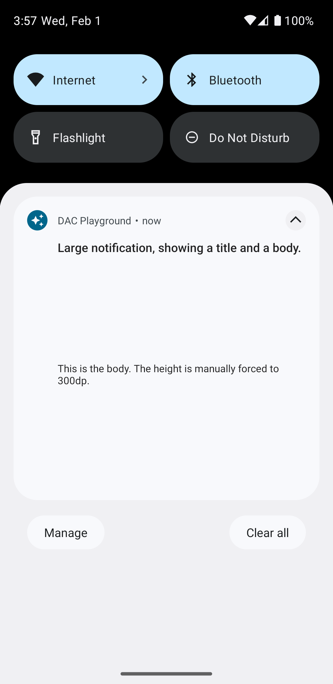
android:text="Large notification, showing a title and a body." />
<TextView
android:id="@+id/notification_body"
style="@style/TextAppearance.Compat.Notification.Line2"
android:layout_width="wrap_content"
android:layout_height="wrap_content"
android:layout_weight="1"
android:text="This is the body. The height is manually forced to 300dp." />
</LinearLayout>
通知をビルドして表示する
レイアウトの準備ができたら、次の例に示すようにそれらを使用できます。
Kotlin
val notificationManager = getSystemService(Context.NOTIFICATION_SERVICE) as NotificationManager

// Get the layouts to use in the custom notification.
val notificationLayout = RemoteViews(packageName, R.layout.notification_small)
val notificationLayoutExpanded = RemoteViews(packageName, R.layout.notification_large)

// Apply the layouts to the notification.
val customNotification = NotificationCompat.Builder(context, CHANNEL_ID)
        .setSmallIcon(R.drawable.notification_icon)
        .setStyle(NotificationCompat.DecoratedCustomViewStyle())
        .setCustomContentView(notificationLayout)
        .setCustomBigContentView(notificationLayoutExpanded)
        .build()

notificationManager.notify(666, customNotification)
Java
NotificationManager notificationManager = (NotificationManager) getSystemService(Context.NOTIFICATION_SERVICE);

// Get the layouts to use in the custom notification
RemoteViews notificationLayout = new RemoteViews(getPackageName(), R.layout.notification_small);
RemoteViews notificationLayoutExpanded = new RemoteViews(getPackageName(), R.layout.notification_large);

// Apply the layouts to the notification.
Notification customNotification = new NotificationCompat.Builder(context, CHANNEL_ID)
        .setSmallIcon(R.drawable.notification_icon)
        .setStyle(new NotificationCompat.DecoratedCustomViewStyle())
        .setCustomContentView(notificationLayout)
        .setCustomBigContentView(notificationLayoutExpanded)
        .build();

notificationManager.notify(666, customNotification);
通知の背景色はデバイスによって異なる場合があるので注意してください
管理されます。サポート ライブラリのスタイルを適用します。たとえば、
テキストには TextAppearance_Compat_Notification、
カスタム レイアウトのタイトルには TextAppearance_Compat_Notification_Title
必要があります。これらのスタイルは色のバリエーションに適応するため、
黒地に黒や白の上に白のテキストが
入らないようになります
<TextView
    android:layout_width="wrap_content"
    android:layout_height="match_parent"
    android:layout_weight="1"
    android:text="@string/notification_title"
    android:id="@+id/notification_title"
    style="@style/TextAppearance.Compat.Notification.Title" />
テキストが入力されるため、RemoteViews オブジェクトに背景画像を設定しないようにしてください。
読み取れなくなる可能性があります。
ユーザーがアプリを使用中に通知をトリガーすると、結果は次のようになります。 図 1 のようになります。

展開矢印をタップすると、通知が展開されます(図 2 を参照)。
通知のタイムアウト時間が経過すると、通知は システムバーが図 3 のようになります。
展開矢印をタップすると、通知が展開されます(図 4 を参照)。
フルカスタム通知レイアウトを作成する
通知が標準の通知で装飾されたくない場合は、
アイコンとヘッダーを表示するには、前述の手順に沿って操作します。ただし、setStyle() は呼び出さないでください。