Background
All images wider than #content overflow. This is a solved problem on Timeless, Monobook and Minerva and it is time we applied a global solution for all skins. In some articles, in Vector 2022 the images overlap the side bar, and communities insist that this should be considered a blocker for rolling out Vector 2022 as the default.
For example:
https://en.wikipedia.beta.wmflabs.org/wiki/T113101
This adapts in Minerva and is generally not an issue with legacy Vector which does not have a sidebar on the right, but in Vector 2022 it overlaps the content area.

User story
As a reader I want article images to fit within the available viewport space at all times for all skins.
Acceptance criteria
- Limit floating rules in mediawiki.skinning to`@media screen and ( min-width: @width-breakpoint-tablet ) {`
- Move the thumbnail styles that make images full screen on mobile from from Minerva to mediawiki.skinning so they apply to Vector 2022 and Minerva skin.
- Replace the #content selector with body.skin--responsive .mw-parser-output
- Once the above is merged add skin--responsive to the BODY element on Vector 2022 (this is our rollback strategy in case of an issue)
- Post a patch to Minerva that removes reference to the noresize class added in T330527 and the styles you have upstreamed to core as part of this task.
QA in beta
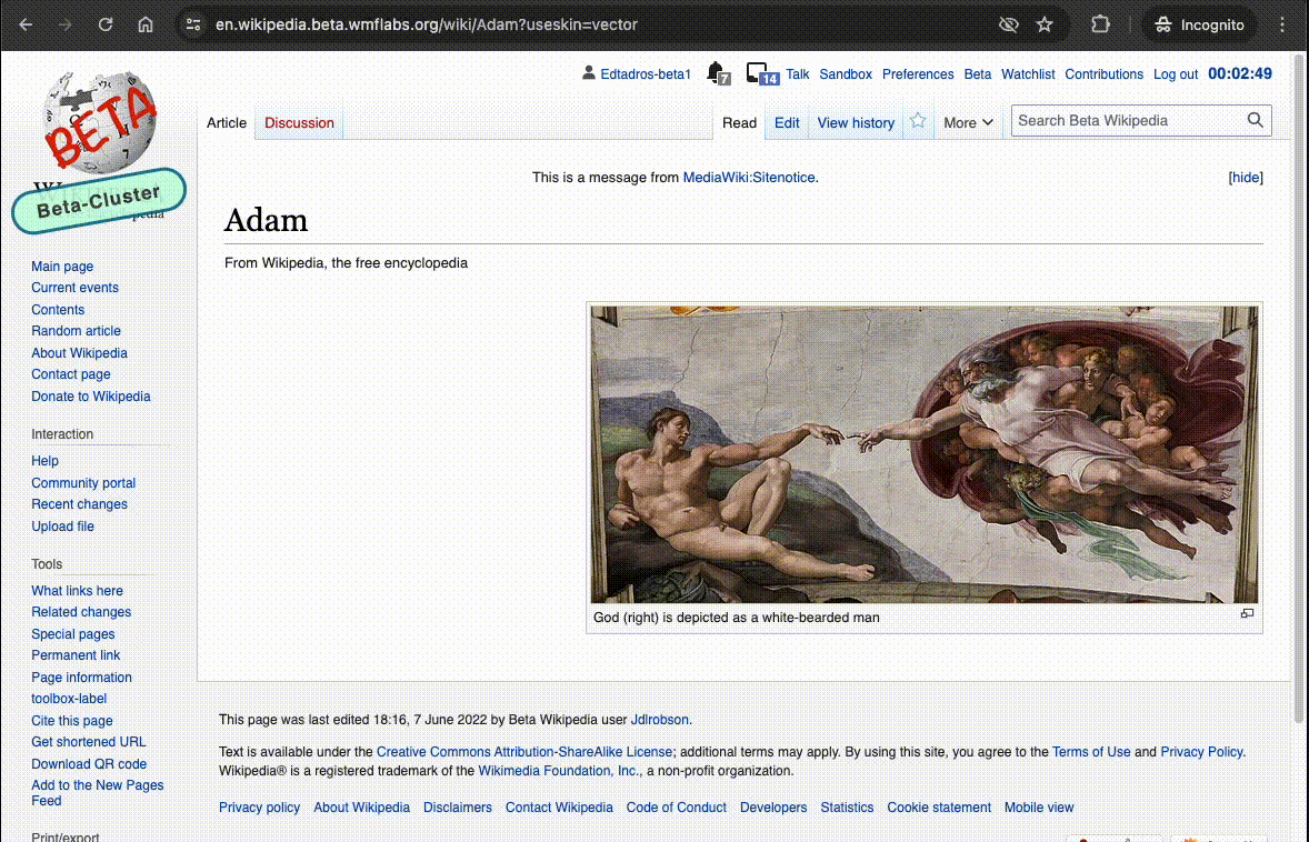
- Visit https://en.wikipedia.beta.wmflabs.org/wiki/Adam?useskin=vector and resize browser, the image should not resize as the window shrinks
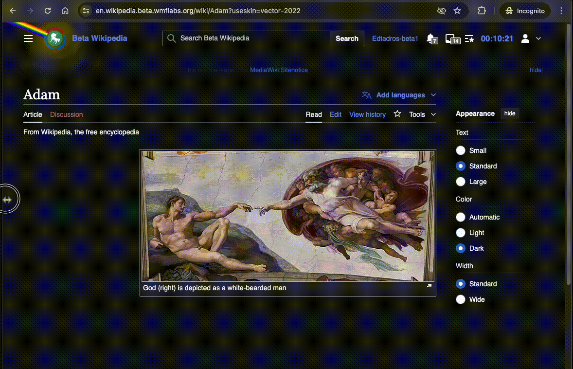
- Visit https://en.wikipedia.beta.wmflabs.org/wiki/Adam?useskin=vector-2022 and resize browser, the image should resize as the window shrinks
- Check Parsoid HTML compatibility: Visit https://en.wikipedia.beta.wmflabs.org/wiki/T310286 and edit using VisualEditor. Make sure the image is constrained to the container (see T310286)
QA
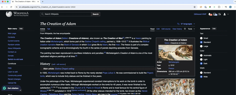
- Visit https://en.wikipedia.org/wiki/The_Creation_of_Adam?useskin=vector and resize browser, the image should not resize as the window shrinks
- Visit https://en.wikipedia.org/wiki/The_Creation_of_Adam?useskin=vector-2022 and resize browser, the image should resize as the window shrinks
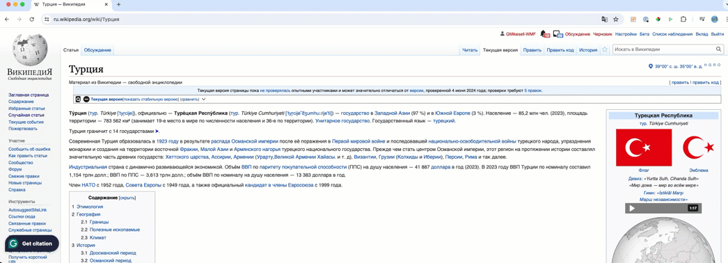
- Visit https://ru.wikipedia.org/wiki/%D0%A2%D1%83%D1%80%D1%86%D0%B8%D1%8F - no content should overlap the two Vector side bars.
Requirement
Ensure images are responsive and restrained to a max-size in the Vector skin, avoiding overflow issues and enhancing compatibility across different skins. Test this functionality in both beta and production environments.
BDD
gherkin
Feature: Responsive Images in Vector

  Scenario: Ensure images are responsive and fit within the available viewport
    Given the user is viewing a page in the Vector skin
    When an image is displayed
    Then the image should be responsive and restrained to a max-size
    And the image should not overflow or overlap other content
Test Steps
Test Case 1: Verify Responsive Images in Vector Skin
- Enable the responsive images feature.
- For beta testing, use the links in the beta links table. For production testing, use the links in the production links table.
- Resize the browser window to verify image responsiveness.
- AC1: Confirm that images resize appropriately as the window shrinks.
- AC2: Confirm that images are constrained to the container and do not overlap other content.
Beta Links:
| # | Page Link | Screenshot |
|---|---|---|
| 1 | Adam?useskin=vector | |
| 2 | Adam?useskin=vector-2022 | |
| 3 | T310286 | |
Production Links:
| # | Page Link | Screenshot |
|---|---|---|
| 1 | The_Creation_of_Adam?useskin=vector | |
| 2 | The_Creation_of_Adam?useskin=vector-2022 | |
| 3 | Турция | |
Notes
Videos are already OK:
Roll back plan
This change will be rolled out with style improvements for tables, infoboxes, hatnotes and images that improve how they display for mobile screens.
In case of unforeseen issues with tables/images, that severely damage the readability of the wiki per our criteria for rolling back the train we can revert the following patch safely at any given time to prompt more conversation/iteration:
https://gerrit.wikimedia.org/r/c/mediawiki/skins/Vector/+/1038894
QA Results - Beta
| AC | Status | Details |
|---|---|---|
| 1 | ✅ | T113101#9889579 |
QA Results - PROD
| AC | Status | Details |
|---|---|---|
| 1 | ✅ | T113101#9894373 |
| 2 | ✅ | T113101#9894373 |
| 3 | ✅ | T113101#9894373 |