Page MenuHomePhabricator

[VISUAL CHANGE] Make diffs and change lists text accessible in both day and night modes
Closed, ResolvedPublic2 Estimated Story Points

Assigned To
Authored By
JScherer-WMF
Apr 3 2024, 4:12 PM
Referenced Files
F56459787: lighterr.png
Tue, Jul 16, 10:59 AM
F56459672: current.png
Tue, Jul 16, 10:59 AM
F56450735: screenshot 202.png
Tue, Jul 16, 1:35 AM
F56450727: screenshot 201.png
Tue, Jul 16, 1:35 AM
F56450686: screenshot 200.png
Tue, Jul 16, 1:35 AM
F56450678: screenshot 199.png
Tue, Jul 16, 1:35 AM
F56450531: screenshot 198.png
Tue, Jul 16, 1:35 AM
F56450524: screenshot 197.png
Tue, Jul 16, 1:35 AM
Tokens
"Heartbreak" token, awarded by Ponor."Heartbreak" token, awarded by Jack_who_built_the_house."Like" token, awarded by JScherer-WMF."Like" token, awarded by Jdlrobson.

Description

NOTE: To restore the previous colors some instructions are provided in T361717#9910664.

User story

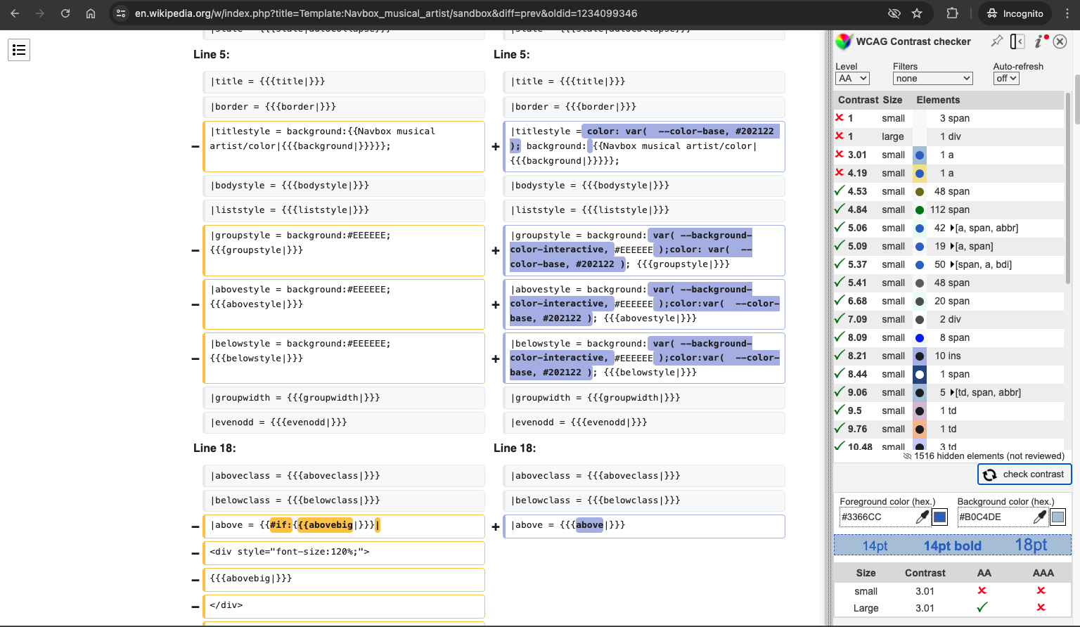
As a Wikipedia contributor, I want the text representations of added and removed content to have at least a 4.5:1 contrast ratio on the background in both day and night mode on desktop and mobile.

Requirements

Designs

addedday modenight mode
byte content@color-green-700@color-green-400
diff background@color-blue-300@color-blue-700
diff border@color-blue-300@color-blue-700
removedday modenight mode
byte content@color-red-700@color-red-400
diff background@color-yellow-500@color-yellow-700
diff border@color-yellow-500@color-yellow-700

recent changes day.png (102×476 px, 1 KB)

recent changes night.png (102×476 px, 1 KB)

diff day.png (803×1 px, 85 KB)

diff night.png (803×1 px, 87 KB)

Figma dev mode link

Design Decision

To add a bit more explanation, the original colors are not colors available in Codex. So to assign these as tokens, we need to use the closest existing color while considering how the two new colors compare to one another.

The color for added text changes from the dark green to green700.
The color for removed text changes from the dark red to red700.
These are relatively subtle changes.

The color for diff added background changes from the light blue to a slightly darker blue, blue300.
The color for diff removed background changes from the light yellow to a slightly darker but also brighter yellow, yellow500.
Although the closest colors to the originals for this application would be the 100 values of each color, this would make these even lighter, further decreasing the contrast and there the accessibility. Instead we move the opposite direction to a darker value. As seen in the Codex option tokens color file, the next value from yellow100 is yellow500. Although the blue spectrum has a blue250 value, in order to be more visually balanced with the diff removed background color of yellow500, we use blue300 instead to address the goal mentioned above:

we need to use the closest existing color while considering how the two new colors compare to one another.

A broader expansion of the color palette is being worked on in T360494 which will provide more values and colors to choose from when we can address a potential revision to how we handle diffs in general as a part of T333681.

QA

Check the following pages match the new color scheme in both day and night mode and mobile and desktop (4 test URLs per bullet point):

Requirement

Ensure that diffs and change lists text are accessible in both day and night modes, maintaining at least a 4.5:1 contrast ratio on the background in both modes for desktop and mobile.

BDD

Feature: Text Accessibility for Diffs and Change Lists in Day and Night Modes

  Scenario: Ensure text accessibility in day and night modes
    Given the user is viewing diffs and change lists
    When the user switches between day and night modes
    Then the text should maintain at least a 4.5:1 contrast ratio on the background

Test Steps

Test Case 1: Verify Text Accessibility in Day and Night Modes

  1. Navigate to Special:RecentChanges.
  2. Switch between day and night modes.
  3. AC1: Confirm that the text on 4 diff pages maintains at least a 4.5:1 contrast ratio.
  4. Navigate to Special:Contributions.
  5. Switch between day and night modes.
  6. AC2: Confirm that the text on 4 diff pages maintains at least a 4.5:1 contrast ratio.
  7. Navigate to Template talk:Navbox history.
  8. Switch between day and night modes.
  9. AC3: Confirm that the text on 4 diff pages maintains at least a 4.5:1 contrast ratio.
  10. Navigate to Special:Watchlist.
  11. Switch between day and night modes.
  12. AC4: Confirm that the text on 4 diff pages maintains at least a 4.5:1 contrast ratio.

QA Results - Prod

Related Objects

StatusSubtypeAssignedTask
Resolvedovasileva
Resolvedovasileva
Resolvedovasileva
ResolvedJdlrobson
Resolvedovasileva
Resolvedovasileva
ResolvedJScherer-WMF
Resolvedovasileva
ResolvedSpikeSToyofuku-WMF
Resolvedovasileva
Resolvedovasileva
ResolvedJdlrobson
Resolvedovasileva
ResolvedBUG REPORTJdlrobson
ResolvedBUG REPORTJScherer-WMF
ResolvedJdlrobson
DuplicateFeatureNone
ResolvedSpikeJdlrobson
ResolvedJdlrobson
Resolvedovasileva
ResolvedFeatureJdlrobson
DuplicateNone
ResolvedJdlrobson
Resolvedovasileva
DuplicateJdlrobson
ResolvedJdlrobson
DuplicateNone
ResolvedJdlrobson
ResolvedBUG REPORTovasileva
Resolvedovasileva
InvalidNone
InvalidJdlrobson
DuplicateNone
DuplicateNone
DuplicateNone
DuplicateNone
Resolvedovasileva
ResolvedJdlrobson
ResolvedJdlrobson
ResolvedJdlrobson
ResolvedJdlrobson
DuplicateJdlrobson
ResolvedJdlrobson
ResolvedJdlrobson
DeclinedJdlrobson
ResolvedSToyofuku-WMF
ResolvedJdlrobson
ResolvedKSarabia-WMF
ResolvedNone
OpenNone
Resolvedovasileva
ResolvedJdlrobson
ResolvedBUG REPORTJdlrobson
DuplicateBUG REPORTNone
ResolvedBUG REPORTovasileva
Openovasileva
ResolvedBUG REPORTovasileva
ResolvedBUG REPORTabi_
ResolvedBUG REPORT Nikerabbit
ResolvedBUG REPORTovasileva
ResolvedJdlrobson
ResolvedBUG REPORTJdlrobson
Resolvedovasileva
Resolvedovasileva
Resolvedovasileva
Resolvedovasileva
Resolvedovasileva
ResolvedFeatureNone
OpenNone
Resolvedovasileva
Resolvedovasileva
Resolvedovasileva
Resolvedovasileva
Resolvedovasileva
Resolvedovasileva
ResolvedBUG REPORTovasileva
ResolvedJdlrobson
ResolvedJdlrobson
ResolvedNone
ResolvedJdrewniak
Resolvedovasileva
ResolvedBUG REPORTovasileva
Resolvedovasileva
Resolvedovasileva
ResolvedJdlrobson
ResolvedJdlrobson
Resolvedovasileva
ResolvedJdrewniak
ResolvedJScherer-WMF
Resolvedovasileva
Resolvedovasileva
ResolvedBUG REPORTovasileva
OpenNone
OpenEdtadros
Resolvedovasileva
In ProgressDTorsani-WMF
ResolvedVolker_E
ResolvedBUG REPORTJdlrobson
ResolvedJdlrobson
ResolvedDTorsani-WMF

Event Timeline

There are a very large number of changes, so older changes are hidden. Show Older Changes

Confirmed!

To add a bit more explanation, the original colors are not colors available in Codex. So to assign these as tokens, we need to use the closest existing color while considering how the two new colors compare to one another.

The color for added text changes from the dark green to green700.
The color for removed text changes from the dark red to red700.
These are relatively subtle changes.

The color for diff added background changes from the light blue to a slightly darker blue, blue300.
The color for diff removed background changes from the light yellow to a slightly darker but also brighter yellow, yellow500.
Although the closest colors to the originals for this application would be the 100 values of each color, this would make these even lighter, further decreasing the contrast and there the accessibility. Instead we move the opposite direction to a darker value. As seen in the Codex option tokens color file, the next value from yellow100 is yellow500. Although the blue spectrum has a blue250 value, in order to be more visually balanced with the diff removed background color of yellow500, we use blue300 instead to address the goal mentioned above:

we need to use the closest existing color while considering how the two new colors compare to one another.

A broader expansion of the color palette is being worked on in T360494 which will provide more values and colors to choose from when we can address a potential revision to how we handle diffs in general as a part of T333681.

Change #1041814 had a related patch set uploaded (by Jdlrobson; author: Jdlrobson):

[mediawiki/skins/MinervaNeue@master] Use upstream codex variables for diffs and red links

https://gerrit.wikimedia.org/r/1041814

Change #1031504 merged by jenkins-bot:

[mediawiki/core@master] Use Codex design tokens in diff.less

https://gerrit.wikimedia.org/r/1031504

Change #1031511 merged by jenkins-bot:

[mediawiki/core@master] Use standard Codex colors on changelist diffs

https://gerrit.wikimedia.org/r/1031511

Change #1041814 merged by jenkins-bot:

[mediawiki/skins/MinervaNeue@master] Use upstream codex variables for diffs and red links

https://gerrit.wikimedia.org/r/1041814

Jdlrobson renamed this task from Make diffs and change lists text accessible in both day and night modes to [VISUAL CHANGE] Make diffs and change lists text accessible in both day and night modes.Jun 14 2024, 10:02 PM

I want to suggest using pure black / --color-emphasized for changed text in ‘day theme’ because currently, the new ‘added’ colour feels pretty much hard to read with the grayish colour used for text by default. Maybe it is just my impression, but I think when this gets deployed, you will hear many similar opinions, especially since this change will take communities by surprise.

The color choice for light mode makes no sense to me. Desaturated blue (almost gray) versus saturated yellow. I mean, colors shouldn't be completely random, decided solely by the existing palette and numbers; there should be at least some concern for aethetics, even if we agree the colors don't necessarily have to be meaningful. The "added content" background is just repulsive to me as background for text, even if it passes WCAG 2.1.

I agree with the above, these colors (at least in light mode) are way too intense and saturated., distracting from the actual content itself.

Is it possible to override this change using CSS?

@1AmNobody24 from enwiki thread: (https://en.wikipedia.org/wiki/Wikipedia:Village_pump_(technical)#Heads-up:_Diff_colour)

.diff-deletedline {

border-color: #ffe49c;

}
.diff-addedline {

border-color: #a3d3ff;

}
.diff-deletedline .diffchange,
.mw-diff-inline-deleted del, .mw-diff-inline-changed del, .mw-diff-inline-moved del {

background: #ffebad;

}
.diff-addedline .diffchange,
.mw-diff-inline-added ins, .mw-diff-inline-changed ins, .mw-diff-inline-moved ins {

background: #a3d3ff;

}

Though if these are problematic, it would be best addressed at the root

I would recommending adding the following code to https://en.wikipedia.org/wiki/Special:MyPage/vector-2022.css to restore the old colors (it's cleaner and less prone to breakage than the one suggested by @Xaosflux)

:root {
  --color-content-added:  #006400;
  --color-content-removed: #8b0000;
  --background-color-content-removed: #ffe49c;
  --background-color-content-added: #a3d3ff;
}

If using a skin other than Vector 2022 for desktop site in addition to the above also add:

.diff-deletedline {
  border-color: #ffe49c;
}
.diff-addedline {
  border-color: #a3d3ff;
}
.diff-deletedline .diffchange,
.mw-diff-inline-deleted del, .mw-diff-inline-changed del, .mw-diff-inline-moved del {
  background: #ffe49c;
}
.diff-addedline .diffchange,
.mw-diff-inline-added ins, .mw-diff-inline-changed ins, .mw-diff-inline-moved ins {
  background: #a3d3ff;
}

I agree with JWBTH. The new color has 20% less contrast on the subtitle text. They don't provide adequate contrast.

I don't understand why "background-color-content-added" and "background-color-content-removed" can't use different shades of the same colors as "color-content-added" and "color-content-removed" (i.e. green and red), just as "background-color-success-subtle" and "background-color-error-subtle" use lighter shades of the same colors as "color-success" and "color-error".

https://doc.wikimedia.org/codex/latest/design-tokens/color.html#background-colors

Although the blue spectrum has a blue250 value, in order to be more visually balanced with the diff removed background color of yellow500, we use blue300 instead to address the goal mentioned above:

Actually:

  • the yellow500 (#fc3) has a relative luminance of 0.6468, which gives a 1:1.5 contrast ratio against the white background and 1:10.7 agaist the foreground;
  • the blue300 (#afb6e9) has a relative luminance of 0.4845, which gives a 1:1.96 contrast ratio against the white background and 1:8.21 against the foreground.

They are not visually balanced. This blue is harder to read from than yellow. And while the primary aim of diff is too read from and not to look at, it makes a difference. Yes, the contrast ratios are still above WCAG threshold but it's a drop in readability and not an increase.

However, the mentioned blue250 (#c2d1f0) has a relative luminance of 0.6336, which gives a 1:1.53 contrast ratio against the white background and 1:10.5 against the foreground (very similar to yellow500). This is what can be balanced to match yellow500 without having loss of accessibility at the same time.

I agree however that these new colors seem "too bold" for me (and not only me, I've heard similar voices from the community).

They are not visually balanced. This blue is harder to read from than yellow. And while the primary aim of diff is to read from and not to look at it makes a difference.

Yup.
And it's much worse on m.wikipedia.org where the diff text is not bold.

Screenshot 2024-06-22 at 07-56-27 Earth Difference between revisions - Test Wikipedia.png (629×856 px, 109 KB)

However, the mentioned blue250 (#c2d1f0) has a relative luminance of 0.6336, which gives a 1:1.53 contrast ratio against the white background and 1:10.5 against the foreground (very similar to yellow500). This is what can be balanced to match yellow500 without having loss of accessibility at the same time.

blue250 is better in terms of contrast, but it is even lighter than blue300 in terms of HSL which gives you two colors that have nothing in common: neither hue, nor saturation, nor lightness. Saturated, medium-light yellow against desaturated, light blue. It's basically a warning color against a neutral color which is how they are going to be perceived, whether we want the colors to convey that meaning or not:

image.png (249×1 px, 42 KB)

(https://en.wikipedia.org/w/index.php?title=Capri-Sun&diff=next&oldid=1215001071)

I'm not saying this is necessarily wrong (deleted content needs attention, while added content is supposed to be normal = neutral?), but that's a whole new semantics, and there needs to be a design decision made for switching to it. Or maybe a better idea would be to expand the palette T360494.

I don't understand why "background-color-content-added" and "background-color-content-removed" can't use different shades of the same colors as "color-content-added" and "color-content-removed" (i.e. green and red), just as "background-color-success-subtle" and "background-color-error-subtle" use lighter shades of the same colors as "color-success" and "color-error".

I think the general argument against red and green is that the color blind can't tell them apart.

Wikidata (Wikibase) diffs often contain links, which became barely readable with this change. Using default link color (used by Vector 2022, Minerva and Timeless), the contrast ratio on the added side is about 60% of the AA-level 1:4.5. (Vector 2010 is slightly less bad, but the added side – with a contrast ratio of 1:4.34 – still isn’t WCAG AA-compliant).

Wikidata diff color contrast.png (457×855 px, 97 KB)

One accessibility aspect that hasn't been discussed much is accessibility to those with mild cognitive impairment. If you avoid both red and green in diff colours, you create a barrier for these editors. A better strategy is to stick close to the red-green, for instance orange-teal. Or pinkish red vs blue.

Intuitive colours should also be a help for new editors. I still have to make a conscious effort to read the diffs, slowing down my editing.

Thank you everyone, both in this task and elsewhere, who have provided feedback on the recent diff color changes. Your feedback is incredibly valuable and helpful. As we were attempting to enable color modes and add in new tokens to represent diff colors, we missed some really important things that you all have pointed out, so thank you for your help here. For now, we are going to change these color tokens to use the previous colors for diffs. This update will be included in the Codex release next week, on July 9.

Additionally, we are going to begin work on T360494 to expand the color palette which will enable us to reconsider diff styling more holistically as a part of T333681, where we can revisit what colors we use altogether, including red and green as an option to explore, with a goal of unifying diff colors everywhere. This should set an expectation that the colors will change again. We would greatly appreciate your input on those tasks.

ovasileva raised the priority of this task from Medium to High.Mon, Jul 15, 5:31 PM

@Jdlrobson, I'm leaving this in QA and assigning to you. Once you've created tickets for the issues below feel free to move this to ready for signoff.

Test Result - Prod

Status: ❌ FAIL
Environment: enwiki
OS: macOS Sonoma
Browser: Chrome
Device: MBS
Emulated Device: NA

Test Artifact(s):

Test Steps

Test Case 1: Verify Text Accessibility in Day and Night Modes

  1. Navigate to Special:RecentChanges.
  2. Switch between day and night modes.
  3. AC1: Confirm that the text on 4 diff pages maintains at least a 4.5:1 contrast ratio.
StatusURLDark ModeLight ModeComment
diff 1
screenshot 166.png (892×1 px, 262 KB)
screenshot 169.png (892×1 px, 270 KB)
no issues
diff 2
screenshot 167.png (892×1 px, 328 KB)
screenshot 168.png (892×1 px, 314 KB)
Dark mode removed text contrast fails.
diff 3
screenshot 170.png (892×1 px, 388 KB)
screenshot 171.png (892×1 px, 357 KB)
screenshot 172.png (892×1 px, 376 KB)
Dark mode removed text and the section heading contrast fail.
diff 4
screenshot 173.png (892×1 px, 231 KB)
screenshot 174.png (892×1 px, 263 KB)
screenshot 175.png (892×1 px, 272 KB)
Dark mode removed text and the section heading contrast fail.
  1. Navigate to Special:Contributions.
  2. Switch between day and night modes.
  3. AC2: Confirm that the text on 4 diff pages maintains at least a 4.5:1 contrast ratio.
StatusURLDark ModeLight ModeComment
diff 1
screenshot 176.png (892×1 px, 281 KB)
screenshot 177.png (892×1 px, 272 KB)
no issues
diff 2
screenshot 178.png (892×1 px, 270 KB)
screenshot 179.png (892×1 px, 261 KB)
Dark mode removed text contrast fail.
diff 3
screenshot 180.png (892×1 px, 305 KB)
screenshot 181.png (892×1 px, 298 KB)
Dark mode removed text contrast fail.
diff 4
screenshot 182.png (892×1 px, 297 KB)
screenshot 183.png (892×1 px, 293 KB)
Dark mode removed text contrast fail.
  1. Navigate to Template talk:Navbox history.
  2. Switch between day and night modes.
  3. AC3: Confirm that the text on 4 diff pages maintains at least a 4.5:1 contrast ratio.
StatusURLDark ModeLight ModeComment
diff 1
screenshot 186.png (1×1 px, 360 KB)
screenshot 185.png (1×1 px, 361 KB)
screenshot 187.png (1×1 px, 349 KB)
Dark mode removed text and the section heading contrast fail. There are a number of other contrast issues here but they are unrelated to the diff text.
diff 2
screenshot 189.png (1×1 px, 343 KB)
screenshot 188.png (1×1 px, 329 KB)
Dark mode section heading contrast fails.
diff 3
screenshot 190.png (1×1 px, 365 KB)
screenshot 191.png (1×1 px, 350 KB)
Dark mode section heading contrast fails.
diff 4
screenshot 192.png (1×1 px, 352 KB)
screenshot 193.png (1×1 px, 339 KB)
There are a number of other dark mode contrast issues that aren't diff text related.
  1. Navigate to Special:Watchlist.
  2. Switch between day and night modes.
  3. AC4: Confirm that the text on 4 diff pages maintains at least a 4.5:1 contrast ratio.
StatusURLDark ModeLight ModeComment
diff 1
screenshot 194.png (1×1 px, 334 KB)
screenshot 195.png (1×1 px, 320 KB)
no issues.
diff 2
screenshot 197.png (1×1 px, 358 KB)
screenshot 198.png (1×1 px, 341 KB)
Dark mode section heading contrast fails.
diff 3
screenshot 199.png (1×1 px, 418 KB)
screenshot 200.png (1×1 px, 405 KB)
Dark mode removed text contrast fail.
diff 4
screenshot 201.png (1×1 px, 381 KB)
screenshot 202.png (1×1 px, 367 KB)
Dark mode section heading contrast fails.

I have a question here: from these screenshots, you seem to be satisfied with the blue/purple background in light mode, even though most, if not all complaints are about it. The color probably looks okay on some big, fancy designer monitor for casual testing, but it feels too dark and grayish for any meaningful work, especially on smaller screens (think 14" laptop screen). We'd get the same information if the background was a little lighter (that there was a change somewhere in the text), but the change itself would be easier to read.

While trying to fix the dark mode diffs (how many people will use dark mode to read diffs?), I think you spoiled the experience for the majority of us who actually have to read the diffs in our usual light mode.
You'll say everything is alright there, as the contrast is 4.5:1. But you set the criteria, which some users may have set at 6:1 or 8:1.

So instead of using those numbers, how about you ask your users how they perceive your changes? (you already got some answers above, and here)

Current background:

current.png (270×1 px, 85 KB)

A little lighter, already makes things better:
lighterr.png (270×1 px, 85 KB)

  1. AC1: Confirm that the text on 4 diff pages maintains at least a 4.5:1 contrast ratio.
StatusURLDark ModeLight ModeComment
diff 2
screenshot 167.png (892×1 px, 328 KB)
screenshot 168.png (892×1 px, 314 KB)
Tracked in T368789
diff 3
screenshot 170.png (892×1 px, 388 KB)
screenshot 171.png (892×1 px, 357 KB)
screenshot 172.png (892×1 px, 376 KB)
Tracked in T368789 and T363878.
diff 4
screenshot 173.png (892×1 px, 231 KB)
screenshot 174.png (892×1 px, 263 KB)
screenshot 175.png (892×1 px, 272 KB)
Tracked in T368789 and T363878.
  1. Navigate to Special:Contributions.
  2. Switch between day and night modes.
  3. AC2: Confirm that the text on 4 diff pages maintains at least a 4.5:1 contrast ratio.
StatusURLDark ModeLight ModeComment
diff 2
screenshot 178.png (892×1 px, 270 KB)
screenshot 179.png (892×1 px, 261 KB)
Tracked in T368789.
diff 3
screenshot 180.png (892×1 px, 305 KB)
screenshot 181.png (892×1 px, 298 KB)
Tracked in T368789 and T363878.
diff 4
screenshot 182.png (892×1 px, 297 KB)
screenshot 183.png (892×1 px, 293 KB)
Tracked in T368789 and T363878.
  1. Navigate to Template talk:Navbox history.
  2. Switch between day and night modes.
  3. AC3: Confirm that the text on 4 diff pages maintains at least a 4.5:1 contrast ratio.
StatusURLDark ModeLight ModeComment
diff 1
screenshot 186.png (1×1 px, 360 KB)
screenshot 185.png (1×1 px, 361 KB)
screenshot 187.png (1×1 px, 349 KB)
Tracked in T368789 and T363878.
diff 2
screenshot 189.png (1×1 px, 343 KB)
screenshot 188.png (1×1 px, 329 KB)
Tracked in T363878.
diff 3
screenshot 190.png (1×1 px, 365 KB)
screenshot 191.png (1×1 px, 350 KB)
Tracked in T363878.
  1. Navigate to Special:Watchlist.
  2. Switch between day and night modes.
  3. AC4: Confirm that the text on 4 diff pages maintains at least a 4.5:1 contrast ratio.
StatusURLDark ModeLight ModeComment
diff 2
screenshot 197.png (1×1 px, 358 KB)
screenshot 198.png (1×1 px, 341 KB)
Tracked in T363878.
diff 3
screenshot 199.png (1×1 px, 418 KB)
screenshot 200.png (1×1 px, 405 KB)
Tracked in T363878.
diff 4
screenshot 201.png (1×1 px, 381 KB)
screenshot 202.png (1×1 px, 367 KB)
Tracked in T363878.

Wikidata (Wikibase) diffs often contain links, which became barely readable with this change. Using default link color (used by Vector 2022, Minerva and Timeless), the contrast ratio on the added side is about 60% of the AA-level 1:4.5. (Vector 2010 is slightly less bad, but the added side – with a contrast ratio of 1:4.34 – still isn’t WCAG AA-compliant).

Wikidata diff color contrast.png (457×855 px, 97 KB)

Where is this one tracked?

Nowhere right now... Could you create a new bug for this? I'm not sure how to replicate this particular issue. The diff code is really convoluted (gadgets/extensions etc) so I'll need to work out what to tag it with but you can tag it with MediaWiki-Page-diffs for now. Thanks in advance!

I'm not sure how to replicate this particular issue.

To reproduce it in production, simply open https://www.wikidata.org/w/index.php?title=Q908430&diff=2183601451 (pictured in my original comment), or almost any other Wikidata diff. To reproduce it locally, I’m not sure – it’s generated by Wikibase, so if you happen to have a locally installed Wikibase repository, you’re good to go, but otherwise it probably won’t be that easy.

On the other hand, Wikibase just uses the standard diff colors and the standard link color, so I don’t think it could be fixed in Wikibase. (Maybe even the local reproduction could be done by writing a simple extension that does nothing but creates diffs containing links.)

-> T370193