


The positivity measure for every single question has increased between this year’s National Student Survey (NSS) and last year.
We’ve seen particular improvements noted in questions around the quality of teaching, the way students are listened to, and on the mental health information question.
And students are 0.5 per cent more able to express their opinions than last year.
After three fallow years, 2024 also brings the return of the healthcare question bank to public data for the first time since 2020. This is only the second year of this particular survey design, so we’re short of any kind of a meaningful time series (was last year weird? Or this year? Or both) even for the main questions.
Getting in to the data
Though the national picture is broadly positive, NSS only really starts making sense the closer you get to smaller groups of students in subject areas. Away from the broad pronouncements, the real work will begin in providers to make sense of where students are experiencing particular issues.
However, the Data Futures gremlins make for slightly less confidence about the accuracy of the data and benchmarks underpinning these insights – concerns about student characteristics data mean that data from previous years (about the same students) has been used, but there is still a higher level of missing data than in recent years. Six providers had to provide their own target lists, as OfS was unable to generate them from the data it held.
There are also specific data quality issues for four providers:
- Navitas UK (a provider that runs a number of international colleges associated with larger providers) has the opposite issue, where some students taught at Navitas but registered elsewhere may be shown as being taught by a different provider.
- The universities of Hertfordshire and Bedfordshire student data returns did not fully meet OfS data quality requirements. At Hertfordshire the problem is underreporting of student disabilities, while at Bedfordshire some students may have wrongly been recorded as full time.
- The University of Chester had an issue with academic partnership data, meaning some students at partner providers may be shown as studying at the university. This has now been sorted, although the initial publication of the NSS included the caveat.
NSS responses
OfS gathered responses in early 2024, largely from the graduating cohort of 2024. This was the first cohort in a while not to have been affected by industrial action in their final year – though students may have experienced disruption during the early parts of their course linked to the Covid response and industrial action.
Accordingly, the response rate overall is up (72.3 per cent this year, compared to 71.5 last year), yet the proportion of students who completed the survey but did not engage with it (giving the same answer for every question) is up from 3.2 per cent to 3.8 per cent. OfS recognises that some students may have done this legitimately – they were equally satisfied or dissatisfied with all aspects – but notes that only 1.9 per cent gave the same answer to all but one question.
Students also get the option to select “this does not apply to me”: for most questions this is under one per cent of responses, but for the Students’ Union question (Q25) this is 14.5 per cent.
We will, apparently, be getting results split by student characteristics in the autumn – providers will get splits by characteristics at the same time. This is slightly marred by issues with the Data Futures return – in most cases for NSS purposes it has been possible to use data on the same students for previous years for ethnicity, sex, care experience, and socioeconomic classification.
In the meantime, we do get response rates by these and other characteristics. Male students (68.3 per cent) are less likely than female students (74.90 per cent) to respond to the national student survey – but the real outliers are part-time (58.30 per cent) and distance (56.30 per cent) students. Law students are less likely (65.60 per cent) than students of any other subject area to respond to the NSS.
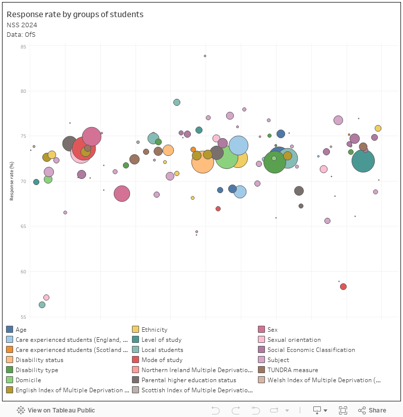
[Full screen] response rates
This chart shows (on the vertical axis) response rates for various groups of students, the size of the mark shows the size of the target population. You can select combinations of characteristics by clicking on the legend at the bottom.
NSS results dashboards
With those caveats in mind, here are three dashboards that will allow you to interrogate the public NSS data. You should note that provider data is at a greater resolution, and may include data that is suppressed in this publication due to low numbers. The provider release also includes free-text comments, which are invaluable in understanding why students have said what they have said.
Whole provider
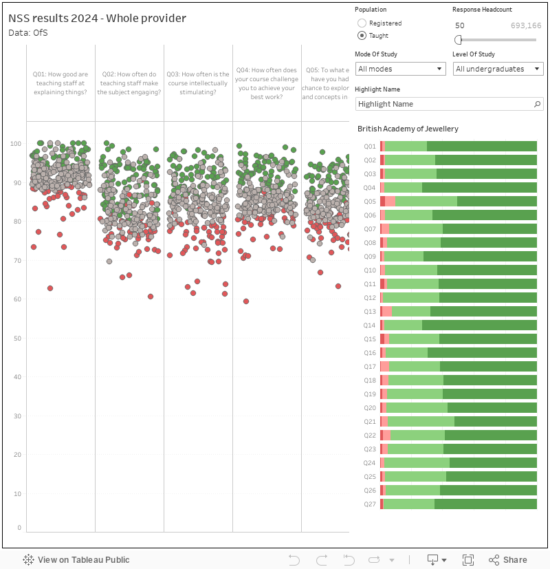
Though NSS is way more use at the level of individual subject areas, the top line (provider level) scores get a lot of press attention. The chart on the left shows provider level positivity measures (responses of 1 or 2) for each question (scroll along using the bar at the bottom to see them all) – with each mark representing a provider. You can highlight a provider of interest using the controls on the right – and you can set the other filters by mode of study, level of study, or registration status (“registered” students may be at partner institutions, “taught” students are not. By default I’ve filtered out providers with less than 50 students: you can change that if you like. Mousing over a dot shows a digest of all responses to all questions: note that the proportions refer to all students who expressed a preference, not all students who answered.
Subject level
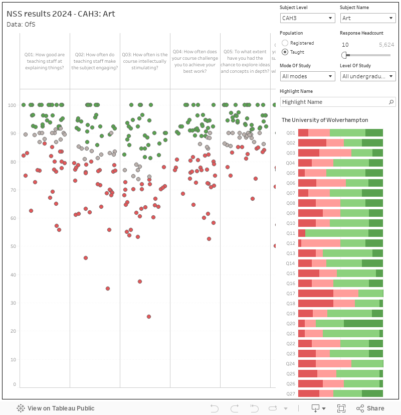
This version adds controls for subject level and subject name – allowing you to view performance at providers across the sector for each question at various levels of subject resolution. CAH3 is the smallest (very precise, but you are dealing with low numbers), CAH1 is the broadest. Here, I’ve filtered out areas with less than 10 students.
Individual provider
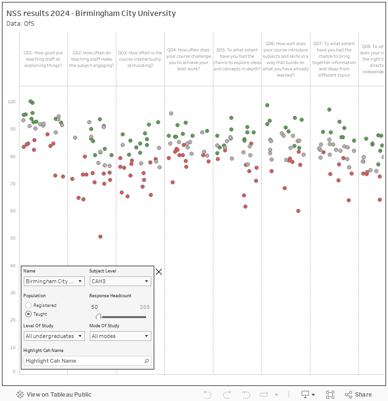
There’ll be someone in your provider looking at a chart much like this – showing performance by subject area within a provider. Expect questions to be asked where subject areas are seen not to be giving students what they might expect: good universities will do this via a process of enhancement driven by a listening exercise, bad universities will haul the course leaders in front of the vice chancellor for a row.
Thank you for your analysis as ever David. To note that Chester submitted a correction when the issue was reported to us and OfS have not been back in touch for further information. We assume, therefore, that the matter is resolved.
Thanks David – where do I find Durham – we don’t seem to be in your drop down list
It is definitely in there. Just start typing Durham in the box and it will turn up
Make sure the subject name is clear before typing the name in the Subject Level tableau – Durham doesn’t do Art hence not in the dropdown
Durham certainly not there for English?
Some NSS data is suppressed where there are insufficient responses.
Something which is crucial (but often ignored??) is the extent to which any of the differences across subjects/institutes are actually statistically significantly different. Yes, the sample sizes may become impressive at some levels of analysis, but proportion data require decent sample sizes to parse small effect sizes. It would be really useful to have (the correct, binomial) 95% confidence intervals around all estimates prior to attempts at interpretation. After all, the NSS is a sampling process, and the differences between institutes are often tiny. How many of them are real? Data such as these should never be presented for interpretation without relevant assessments of (statistical) error.
These are shown on the OfS dashboards