I’m an interior designer & these paint colours are best to be avoided – one could even devalue your house
AN interior expert has revealed the top five colours to avoid at all costs when decorating your house.
Zoe Warren, interior design expert at PriceYourJob, shared the colours to give a pass if you are to sell your property at some point, Express reported.

Having a fresh coat of paint can certainly impress potential buyers and can even increase the value of your house - but not all colours, as trendy as they might be, are good for sellers.
Some, it turns out, can actually devalue the property.
Mid green
With social media going crazy over earthy tones, green has become all the rage as of recent.
However, there are certain shades of green that are best to be avoided - dark and mid greens being the ones.
Read more home transformation stories

''Colours that blend in with the surrounding foliage as it can look unappealing,'' the expert explained.
''They also make it difficult for potential buyers to notice your home.''
Instead, she suggested, try incorporating deeper greens by adding porch accents and living things.
''Plants can accentuate the lighter shades on your walls,'' Zoe added.
Most read in Lifestyle


Dark brown
If you're thinking of putting your house on the market, dark brown is another no-no.
The reason dark brown is so unappealing as a wall colour, according to the professional, is that people often associate this colour with “dirt”.
She continued: ''It can clash with wooden furniture and make a room appear dingy.''
If you like a rich, natural colour scheme, brown is still fine - but make sure to choose softer shades as they are a good alternative when paired with muted colours of grey.
Citrus green
Just as darker shades of green, its brighter cousin is also notorious for decreasing house value.
''Whilst they [neon colours] stand out, they can be unappealing to others and are more likely to clash with your furniture.
For those home owners who want a brighter shade of green, Zoe recommended to opt for “soft sage on a feature wall”.
''Ideally one you see when you first enter the room.''
Bright yellow
With some loving it and others detesting it, yellow has always been a controversial colour in interior design.
But while some might find it cheerful, Zoe claimed it can easily put off potential buyers - the shade of yellow is key here.
Soft, pastel yellows are usually fine, but the expert said it’s in your best interests to steer away from the brightest yellow, which ''can be overwhelming in your home''.
As an alternative, she suggested trying a rich ochre shade paired with white, ''a toned-down version of the cheerful palette''.
Bold black

Black, like yellow, is another colour that's divided opinions across all households.
But if you're amongst those who love it, it might be time to rethink your choices.
While black has become the go-to for many living rooms, Zoe suggested only using it for small areas.
''Black is best left for small accents such as the shutters, for the desired dramatic effect.''
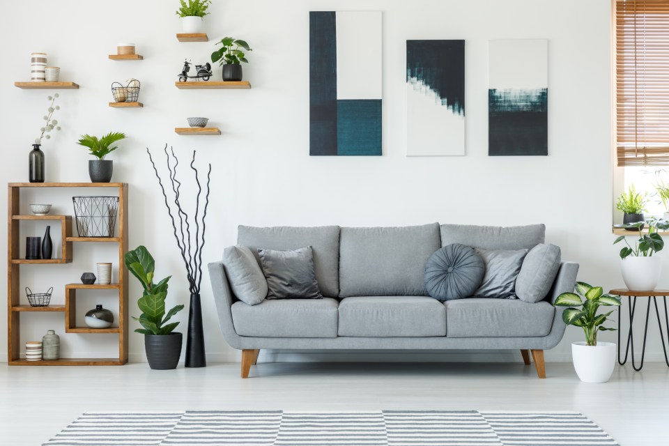
When people are looking to buy neutral is nearly always best.
Plus, an interior designer reveals four things that are making your home look tacky in an instant.
Read More on The US Sun


Meanwhile, a woman de-hinched her grey home for just £50 in favour of rainbow and leopard print walls.
Elsewhere, savvy DIY fan makes plain IKEA chest of drawers look instantly more expensive with £10 Amazon tool & people are obsessed.